
Domain : Process
I began making Domain by drafting a synopsis of the magazine’s contents and intentions.
What kind of magazine did I want Domain to be? Why should it exist?
Domain exists to provide insight into a broad Seattle experience in a way that still feels intimate and local, but casual enough to flip through lightly. It's a great coffee table book. It exists to showcase the unique visual identity and creativity of a specific community through the lens of design.
From there I created personas to bring intention and best understand how to make my magazine appeal to my audience, a creative and travel loving group of people.

I built a design recipe, a system of constraints that kept my decisions consistent and purposeful and to harmonize my articles and create consistency as a brand. My recipe established generous negative space, large-scale, occasionally experimental display headers, a four-column grid, and justified body text.
A design recipe was key to giving me direction on my magazine when I was feeling lost. It was also a good way to harmonize my articles and create consistency as a brand.
To make something that worked, I created uniform layouts structured to a four column grid, and repeated many elements like thick solid lines, large numbers, and hierarchy of article titles and body text.

Seattle has been my photography muse since high school, I knew I wanted to include my photography work in Domain. It brings a personal, intimate touch to the magazine, and the feeling of looking at a city through the lens of a local.
Most of these photos were taken on a Sony Alpha A6400 with a Sigma 18-50mm F2.8 lens and edited in Adobe Photoshop or Lightroom.


I used the iScan Portable Document Scanner for some of the images in Domain, it provides a rich vibrancy and moody texture.
I then created a flat plan and organized articles to create a flow that felt natural, and organize what articles went in the front of the book, back of the book, and what features would fill the middle, as well as ideal placement for Ads.


With the title of Domain chosen, it was time to brainstorm a tagline.
A dialect is “a regional variety of language distinguished by features of vocabulary, grammar, and pronunciation from other regional varieties and constituting together with them a single language” (Merriam Webster)
In this context, a dialect of design is the design language in a specific region. Languages are expansive, living, fluent, and we use them to speak our mind, tell stories and create art.

From a tagline and title comes an identity. One that needs a fitting logo. playing with themes of community, culture, regions, zones, and design, I iterated and iterated.
My final choice was simple, but in shape reminded me of a skyline, wherein shapes emerge from the horizon and form a unique silhouette.


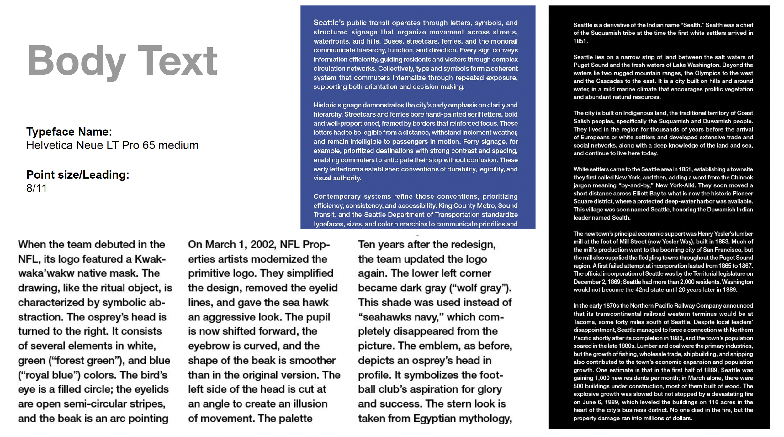
For the body text in Domain, I chose Helvetica Neue LT Pro Medium at 8pt with a leading of 11. After running many test prints, I chose it for its friendliness and ease of reading. It has a certain shortness and roundness that feels easy on the eyes, and with a long magazine, ease of legibility was important to me.
As an accent font, I selected Compacta, which resembles the city of Seattle. It is tight, multi leveled, bold, and varied in height. These features remind me of a dense metropolis filled with both family homes and skyscrapers, and one with varying hills and elevations, ie, mountains , hills, and lakes.

Within my chosen typefaces, I was able to play with pull quote samplers and paragraph headers.
Keeping Domain minimalist in its body text treatment, I chose to have one simple paragraph header, and a larger statement header.
Pull quotes could stand out in many ways, in a range from color changes to full page spreads.


The cover of Domain needed to fit the rest of the magazine’s aesthetic, while also standing out on a shelf. Ultimately, the color red is eye catching and often used in location markings, such as a “You are here” iconic marker. It was important to me, and the readers of Domain, that it be accessible as well, so I opted for high contrast colors, and chose to forgo red on black. For the final cover, I traced a street map of Seattle, adding it to the background of the front cover, which gives personalization and purpose to the Seattle issue, and is eye catching and memorable in its shape.


